Grand prize winner of the logo design competition: LAU Ka-kiu Concept of the design: the logo is formed by a line. The curves in grassy green symbolise mountains and represent the conservation element of the Lantau plan, while the dark grey rectangular shapes symbolise building blocks and represent the development element of the plan. They join as a line to reflect that conservation and development are equally indispensable in the Lantau plan. In addition, one end of the grassy green curve connects with the dark grey part. It embodies the direction of the Lantau plan – integrating conservation into development projects. Lastly, after adjusting the logo design with “mountains” on the left and “building blocks” on the right, we would easily associate the visual image with the Chinese character “嶼”. Hopefully those who see the logo will notice that this development plan is for Lantau.
Grand prize winner of the logo design competition: LAU Ka-kiu
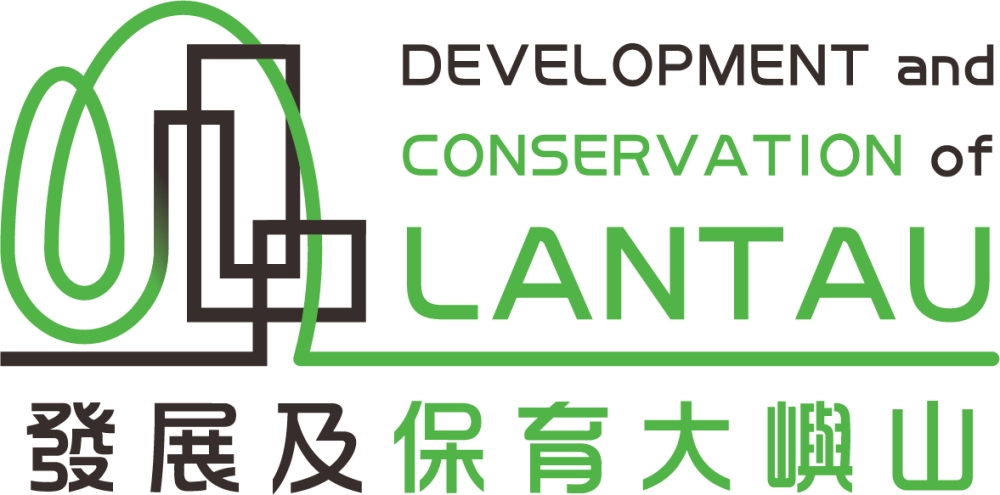
Concept of the design: the logo is formed by a line. The curves in grassy green symbolise mountains and represent the conservation element of the Lantau plan, while the dark grey rectangular shapes symbolise building blocks and represent the development element of the plan. They join as a line to reflect that conservation and development are equally indispensable in the Lantau plan. In addition, one end of the grassy green curve connects with the dark grey part. It embodies the direction of the Lantau plan – integrating conservation into development projects. Lastly, after adjusting the logo design with “mountains” on the left and “building blocks” on the right, we would easily associate the visual image with the Chinese character “嶼”. Hopefully those who see the logo will notice that this development plan is for Lantau.
Close